This post describes our first generation yield curve model, used since the beginning of 2018 to explain the daily changes in long-term rates.
The approach described here is still used to analyse the market for German bunds.
Yet, as far as US Treasuries are concerned, we have moved in 2021 to a second generation model and more recently to a third generation model.
14th March 2018
There are several possible reasons to build models of the interest rates yield curve. And the type of model is likely to depend on what are the main objectives:
- The yield curve model could be built as a quantitative trading instrument in order to beat the market and make some money. This category of models is trying to spot the sort of anomalies that are likely to be corrected rapidly. These anomalies can relate to the overall level of interest rates (i.e. for example interest rates may be too low considering the economic environment) or to some specific segments of the yield curve (i.e. the shape of the yield curve is abnormal). The priority of this class of model, which can often look as statistical black boxes, is the “fit” rather than the theoretical consistency. The target is to find “signals” which are reliably making money. Our model is not in this class of models.
- The yield curve model could be built to control the risks of a diversified portfolio of fixed income instruments, bonds and derivatives. The model should be able to describe well the volatility and correlation of different points in the yield curve, and it should be able to produce prices for complex derivatives based on the assumption that markets are efficient and that all the risk-free arbitrages along the yield curve are being implemented. Contrary to the previous “black boxes” models, the “no-arbitrage”/”efficient market” assumption constrain significantly how these pricing models are built. Our model supposes some form of market efficiency, but it is not primarily built to control risks and price derivatives.
- The yield curve model could be built to better understand what is going on in the market. More precisely, investors have the choice to hold bonds of various maturities or to stick to short-term bills and collect in the future the variable short-term rates. Thus, these choices will crucially depend on their expectations for future short-term rates as forthcoming monetary policy decisions will determine how much they will earn if sticking to short-term bills. Portfolio choices will also depend on the relative risk premia they deem necessary on bonds of various maturities. Thus, this class of yield curve models seek to “explain” the yield curves we observe: how are they “produced” by investors? What are the short rates expectations of the average investor behind these yields? Taking into account these expectations regarding future monetary policies, what are the “embedded” risk premia deemed necessary by the investors that “produce” these yield curve? Our model is broadly in this class of “explanatory” models with some important specificities.
Being able to “explain” yield curves would bring some huge benefits. As far as central banks are concerned, it is very important for them to understand what investors have in mind, to assess whether or not the forthcoming decisions will shock the market or be absorbed smoothly. Indeed, many if not most of the models of this class have been developed in the research departments of central banks. But investors may also benefit a lot from being able to explain prices. True long-term investors, if they still exist…, need to form a view on “embedded” risk premia, i.e. the relative expected returns on various asset classes over the long term (see Risk Premia Investing). This is a difficult task requiring a lot of economic analysis regarding the various economic fundamentals over the medium and long terms (monetary policies, corporate profits, equilibrium exchange rates…). It would help a lot if there was a reliable way of extracting in one click the markets’ expectations regarding these key fundamentals! Moreover, any investor who takes a tactical position in the market, short or long, implicitly states that it disagrees with the average scenario retained by others. Yet, in a rigorous investment process, it is very important to try to be specific about where the disagreement actually lies. As far as the bond market is concerned, are you disagreeing about the likely path of future short rates, i.e. monetary policy decisions? For example, if you are currently bearish in the US bond market, is it because you think that the Fed well stop rising rates later than expected by most markets’ participants? Or while being in broad agreement with the overall market view on growth, inflation and monetary policy, do you specifically disagree about the way markets price risks, i.e. do you believe that the “embedded” duration risk premium should be higher? In our experience, betting on a mistake made by the market in the way it is pricing risk is far more dangerous than trying to benefit from a specific and time-limited divergence of views on some fundamental variables (decisions of monetary policies, corporate profits…)….
For true long-term investors, these “explanatory” models could also be very useful as they describe the origins of the risks that investors will face in the future. As explained in Risk Premia Investing, the origin of risks should play a key role in how long-term investors make assets allocations decisions. When markets move due to an increase in “embedded” risk premia, short-term investors are impacted by a potentially very large decline in prices, but long-term investors will by definition benefit from the higher risk premia embedded in the new prices. As long as the long-term pay-offs linked to monetary policies or corporate profitability have not changed, long-term investors should absorb the short-term volatility driven by embedded risk premia as a minor inconvenience, or even as a chance providing some nice trading opportunities. Obviously, long-term investors should be much more cautious when the volatility of markets reflect a fundamental uncertainty regarding the long-term pay-offs provided by the various asset classes. A fundamental benefit of the “explanatory” yield curve models is that they may allow a better understanding of the true nature of the risks faced by investors, and as a result help build better asset allocation tools well-fitted to the various horizons of investment.
Considering all these potentially huge benefits from having efficient “explanatory” yield curve models, the current situation may appear quite paradoxical. There are many academic papers describing the available models, but they don’t seem to be used by many investors. Indeed, when analysts try to identify what are the market’s expectations regarding monetary policies, they often have a very naïve approach and base their analysis on forward rates. Yet, forward rates are obviously also influenced by risk premia (see Has the Duration Yield Premium Turn Negative? for graphs on the role played historically by risk premia at the short-end of the yield curve) and one of the benefits of the “explanatory” yield curve models is to allow the extraction of the true expectations from observed forward rates.
Why do these models have so little penetrated the world of professional investing? The answer is far from clear, but the most likely answer is that the available models are still experimental prototypes based on some fragile assumptions. At this stage professional investors are probably right to be cautious. In a first part, we’ll describe some of the challenges of building “explanatory” yield curve models and our doubts regarding the current state of the art. In a second part, we’ll describe how we tried to overcome some of these challenges. In some way, we have done that my reducing sharply our initial ambitions! Our yield curve model is currently not used to extract the level of risk premia and what are the true markets’ expectations regarding monetary policies. Our model is only used to measure how these risk premia and these expectations change over time. Thus, it is a key input in our daily monitoring of markets and in our asset allocation optimizer. We’ll explain why we believe it is indeed much more robust to extract changes rather than levels. Finally, another paradox in the current situation is that academics don’t seem very interested in building the equivalent of “explanatory” yield curve model in the equity sphere. Yet, it would also be immensely useful to be able to know in one click what investors expect in terms of future cash flows and what is the equity risk premia they have embedded into equity markets! We’ll finish this post with a few remarks on the first and exploratory lessons drawn from our work in the equities’ field.
Some challenges to build “explanatory” yield curve models.
The main reason why it is difficult to build “explanatory” yield curve models is that too many complex factors play a role in how the yield curve is “produced”! And there are many dangers in forgetting this complexity…. Our yield curve model described later acknowledges this complexity and try to accommodate it at the cost of a (temporary?) reduced ambition.
The first observation is that modelling investors’ expectations regarding future short rates is already rather complex. And still it is nothing relative to the modelling of how markets price risks!
In most economic situation, the average investor has a very subtill view of future short rates. First, investors have a short-term view of where the economy is standing in the economic and monetary cycle. Rates may be rising or falling at variable speed. Secondly, they have a view or when and at what level the top or the bottom of this cycle will be reached. Thirdly, they have a view about the equilibrium rate in the long term taking into account the inflation objectives of central banks and the fundamental balance between saving and investment in the country. Most of the time, investors do not expect a smooth convergence towards this long-term equilibrium: in a tightening cycle, the top rate in the cycle needed to control inflation is in general above the equilibrium rate. This is for example what we observe in the last forecast unveiled by the federal reserve in September 2018. The top of the current tightening cycle was expected by policy makers at the 2020/2021 horizon with a fed fund rate at 3.4% to be compared to an equilibrium rate now put at 3.0% (against 2.9% in the June forecasts).
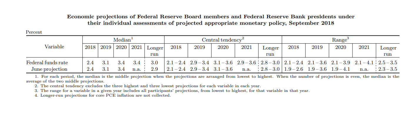
As a result, there are least three factors needed to describe the expected path for short term rates (the current rate, the long-term equilibrium and a medium-term rate, let’s say two years ahead). With three factors model, one probably can get a reasonable description of the future expected path of short-term rates, but it is likely that it will stay rather fuzzy. Indeed, for the same current rate, equilibrium rate and expected rate in two years, you can have rather different expectations for the rate expected in one year, depending on the specificities of the current economic situation (inflation, growth unemployment, beliefs of the Fed’s leadership). In other words, if the Fed was only telling us that it expects the short rate to be at 2.4% at the end of 2018, 3.4% at the end of 2020 and 3.0% in the long run, it would be impossible to guess the exact profile of the rates during the tightening cycle and to guess that the Fed expects short rate at 3.1% at the end of 2019 and 3.4% at the end of 20211. In order to be able to describe all (or almost all) the possible paths taking into account the diversity of economic situations, you probably need at least four or five factors.
The deformations of the yield curve due to changes in risk premia are even more complex, and may need at least three more factors, or maybe much more… As explained many times on this website (see The Four Risk Premia), risk premia vary and asset prices should reflect not only the current “spot” risk premia but also the expected future “spot” risk premia. For example, if there is a stock market crash and a “flight to safety” that benefits government bonds, the “spot” risk premia should collapse as bonds provide a hedge as long as the stock market is under pressure. Yet rational investors will understand that this is a temporary phenomenon and will not price long-term bonds (10-year or 30-year bonds) as if bonds will eternally play this hedging role. They will price bonds under the assumption that the “spot” risk premia will progressively return to what they see as the “normal” level (and this is not the place to come back to the disturbing fact that fundamental investors may be quite wrong about where stands this “normal” risk premia!). The longer investors think that the stock market turbulences will last, the stronger will be the impact on the “embedded” risk premia. Thus, we need at least three factors to describe the risk premia embedded in the bond market as the “embedded” risk premia depends on the current “spot” risk premia, on the long-term equilibrium risk premia and on the speed at which the former will converge on the latter. For a given “spot” risk premium, and a given equilibrium risk premium, the shape of the yield curve will be very different if the return to equilibrium is supposed to be quick (if it is supposed to happen overnight there is no impact on the yield curve!) or if it is expected to be very slow (with a very strong impact on long-term bonds).
And maybe, we cannot stop here…. The bond market is impacted by two broad types of changes: the changes on the expected path of short rates and the changes on the level of “embedded” risk premia. There is no reason to believe that investors need exactly the same risk premium to bear these different risks (this is a point that we discuss a bit more in Has the Duration Risk Premium Turned Negative?). The risk premium associated to changes of expectations about monetary policy could be especially volatile: sometimes markets fear a tightening of monetary policy very much (the current situation in the fall of 2018) and sometimes they are relaxed since they associate it with good surprises on the economic front (and the end of deflation fears). Thus, it may be necessary to introduce two different risk premia with each having its own profile of return to equilibria, i.e. three more factors…. In one word, different situations in terms of the risks born by investors may trigger some extremely varied shape of yield curves.
Thus, there is no doubt that the shape of the yield curve results from a very large set of varying complex factors: on the one hand, there is the specific shape of short rate expectations, which can have a lot of different profiles, and on the other hand there is the time varying risk premia required by investors to bear over time the different risks present in the government bond market.
At the very least, six types of changes will affect in specific ways the yield curve:
- The short-term monetary surprises. The central banks may take a surprising decision with little impact on how the markets see the medium term or long-term path of interest rates. Only the shorter end of the yield curve is impacted.
- The structural changes in the equilibrium interest rates. They can come from changes of the inflation targets set implicitly or explicitly by central banks or from structural changes in the equilibrium real interest rates (due to the demography, the public debt, etc..).
- The business cycle surprises. New forecasts on growth and inflation will change how the markets expect the short rates to travel from their current levels towards their equilibrium levels.
- The structural changes in risk premia. For example, as stressed many times in this website, duration risk premia are likely to be (much) lower when central banks are credible and able to anchor well the inflation expectations.
- The short-live changes in “spot” risk premia. For example, there may be a specific short-term event, for example an important election, which creates a specific environment and require “spot” risk premia different from their equilibrium level.
- The lasting, but not permanent, changes in expected “spot” risk premia. For example, markets may fear the risk of deflation, with a strong impact on the “spot” risk premia required on nominal bonds, but expect central bank to succeed in removing this risk in the medium term. As a result, the yield on very long-term bonds will be little impacted by this lasting but not permanent worry.
In order to illustrate the different types of changes in “embedded” risk premia”, we chose in the preceding paragraph to highlight the consequences of actual changes in the bond market’s external economic and political environment (credibility of central banks, geopolitical uncertainty, deflation fears…). Yet, markets have often their own lives, made of “technical” movements without any fundamental obvious triggers. Indeed, one of the aims of our markets’ monitoring is to try to identify the most likely origin of the movements we observe (see here). As often stressed in this website, markets are complex mechanisms which try to find the “right” price often at the end of a chaotic process: changes in “embedded” risk premia and in the shape of the yield curve without news reflect in part this complex learning process.
This observation that financial markets, as complex pricing mechanisms, live their own life is very important in terms of modelling: it means that it is probably not possible to find a limited set of underlying or “states” variables explaining both how short rates expectations and “spot” risk premia expectations move over time. There are at least 6 true economic and financial factors needed to “explain” the yield curves (and maybe much more…). They cannot be reduced to a smaller number of underlying unobservable variables. Unfortunately, we’ll see that this possibility to reduce the number of relevant fundamental factors is a hypothesis which is behind most, if not all, the models published in the academic literature.
The complexity that we have just described may surprise since there is a widespread view that only three statistical factors are needed to explain most of the different observed shapes of the yield curve. These three parameters are the average level of the yield curve, the slope (how the yields tend to increase or decrease with the bonds’ maturity) and the convexity of the curve. How is it possible to have six or even much more uncompressible true economic factors driving the changes in yield curves and only three clear discernable statistical factors when looking at the data?
The reason is quite obvious: all the economic and financial sources of changes we discussed are likely to produce a rather smooth impact all along the yield curve. No one is going to make the one-year rate rise, while pushing downward the 5-year rate and again higher the 10-year rate! When short rate expectations and “spot” risk premia change, all rates are impacted in the same direction and only the extent of the movement differ smoothly depending on the maturities of the bonds (and whether the underlying shock is lasting or temporary). So, whatever the underlying cause of the movement, it will generally be possible to have a rather accurate description of its impact all over the yield curve with a three-factor statistical model based on “level”, “slope” and “convexity”.
Obviously, this purely statistical observation does not allow you to “explain” the yield curve with a three-factor model. Once, you have extracted the level, slopes and convexity, you have no way to extract rigorously the expected short rates and embedded term premia. Indeed, two almost indiscernible yield curves may be the results of completely different economic and financial scenarios, in terms of short rate and “spot” risk premia expectations.
Fortunately, there is in the literature one, and to our best knowledge only one, recognized model with a large number of factors. Moreover, it has been built in the research department of one of the most prestigious central banks: the US Fed. In the Adrian et al model2 (2013, henceforth ACM), there are five factors. Indeed, five factors may be a reasonable approximation of the “true” six factors model if, for example, there are little medium-term shocks on “spot” risk premia, but mainly a mix of structural changes and short-term surprises described by two factors (we don’t really believe it is the case, but why not…).
ACM’s explanation of the US yield curve in terms of expected short rates and “embedded” risk premia is available on the New-York Fed website (https://www.newyorkfed.org/research/data_indicators/term_premia.html). Moreover, the New York Fed is updating the data daily. Thus, why this model has not become the reference used by market participants looking for an “explanation” of the US yield curve?
The answer is probably that for well-spotted reasons the model is not producing very precise estimates. Indeed, other approaches that we’ll see later are probably much more efficient. As stressed by Kim and Orphanides (2012)3 , “the estimation of dynamic no-arbitrage term structure models with a flexible specification of the market price of risk is beset by severe small-sample problems arising from the highly persistent nature of interest rates”. In other words, as shock on risk premia and shocks on expected short term rates may produce some almost indiscernible shift in yield curves, it is very difficult (impossible?) to estimate precisely this sort of model with the available historical data.
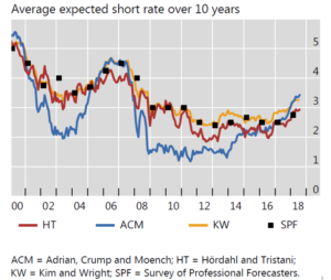
A recent study published in the BIS quarterly review compared the “explanations” provided by different yield curve models and highlighted the implausible results produced by ACM4. For example, ACM put at around 3.5% the average expected short rate for the next 10 years, much above what the board of the Fed is currently expecting. Compared to other models, and the results of various surveys, ACM was also producing some very surprising results between 2008 and 2013 (see the following graph).
As stressed by Kim and Orphanides, in order to estimate the parameters of a yield curve model with a flexible specification of “spot” risk premia, it is probably necessary to add more information on top of the history of past yield curve. In other words, you need to have some additional feedback on the short rates expected by investors to 1/ estimate the structural parameters of the model 2/ use this now well-specified model to “explain” the current yield curve.
There are two ways to do so.
Firstly, you can use the empirical relationship between macroeconomic variables (inflation, output gaps…) and the path of short-term rates considering how central banks react to macroeconomic disequilibrium. In other words, a macro model used in forecasting mode may offer another estimate of the most likely path for future short rates. This is for example the approach of Hördahl, Tristani and Vestin5 (HT) among others who estimated jointly a simplified macro model with a yield curve model. The average short rate estimated through this approach is visible in the previous graph drawn from the BIS paper (curve labelled HT). It looks much more plausible that the short rates estimated by ACM6. Indeed, it is probably quite useful to add to the yield curve some information concerning the current economic situation. Yet, the problem of this approach is that the extremely simplified macro model is unlikely to produce some very accurate forecasts for future short-term interest rates. Thus, we tend to believe that the information put together stay rather inadequate to estimate the five or six factors model needed to describe correctly the relative role of short rate expectations and “spot” risk premia in the various shapes of yield curves that we can observe7.
Thus, there is a natural other approach: using surveys on expected future short rates at various horizons to better calibrate the model and use it to “explain” the observed yield curve. There is little doubt that expectations surveys despite their drawbacks provide a much more accurate view of what investors really expect than simplified macro models. This is for example the approach of Kim and Wright (KW)8, based on the Federal Reserve Bank of Philadelphia’s quarterly Survey of Professional Forecasters (SPF). The average short rate estimated through this approach is visible in the previous graph drawn from the BIS paper (curve labelled KW). The result also seems plausible and indeed not so far from what HT describes9.
Yet, this graph makes clear a striking feature: the yield curve model seems to bring little value added. In general, the average expected short rate over 10 years was very close to what the survey was already revealing (i.e. the curve SPF and KW are very close). One of the few exceptions was since the beginning of 2018, with a model signaling short rate expectations much above what the respondents told the Philadelphia Fed.
We believe that this result is not specific to KW, but inherent to any sort of “explaining” yield curve model. The yield curve is containing much less information than it is generally thought. As already stressed, many different profiles for the expected future short term rates and expected future “spot” premia may lead to the same combination of “level”, “slopes” and “convexity”. Then, when some external information on short rate expectations is added, among all the possible dynamic configurations of short rates and “spot” risk premia, a well-specified model will have no difficulty to accept a short rate profile not very far from the one described by the available survey. We’ll even go one step further: the better the model is specified, the more it will be able to accommodate the expectations revealed by the surveys. The reason is that as already argued a well-specified model cannot have less than five or six factors, because we know that we already need at least three factors to describe the short rate expectations and at the very least two or three factors to describe the autonomous dynamic of the “spot” risk premia. And as you have little more than the “level”, the “slope” and the “convexity” available in the yield curve, with so many available factors to estimate, the model will have no way to radically challenge the expectations revealed by the surveys (if they are reasonably close to the reality). A model with a lower number of factors will more easily challenge the surveys, because it may find more easily an apparent contradiction between the shape of the yield curve and the path expected for future short rates. As KW is a three-factor model, one has to be cautious when the expected path of short rates diverge from the surveys’ results. This is the case currently with average short rates over the next 10 years surprisingly high (above the SPF and even significantly higher than what the Fed expects). Is it the truth or is it an illusion due to the fact that an unusual relationship between expectations and the yield curve’s shape cannot be easily “explained” by a three-factor model?
Despite this paradoxical intuition (“the better the model is specified, the more it will validate the surveys”), we don’t argue here that yield curve models are not useful. Quite the opposite!
- Even if the adjustments brought to the surveys are modest, it would be false to believe that a well-specified yield curve brings no information at all on expected short rates. Corrections would probably be smaller than the corrections brought by a model not very well specified, but at least they would reflect some form of reality10.
- A well-specified model may also allow a better understanding of the “embedded” risk premia. With three factors devoted to the dynamic of the “spot” risk premia, a rich information may be available: what is the “equilibrium” risk premia expected by investors? Are they changing over time (as they should….)? Are the “spot” risk premia at the equilibrium level or not? If not, at what speed is the convergence expected to happen? This sort of information would be very useful to better understand how the market is currently pricing risks (and this could maybe lead to more efficient financial markets….).
Our “explanatory” yield curve model: a brief non-technical description.
From the preceding part, we stress again two fundamental ideas:
- There is no doubt that an accurate model needs at least five factors, probably six, and maybe more. There is no doubt that three factors are already needed to describe short rate expectations (see for example the current profile of the Fed’s expectations). And the observation of the bond market shows that movements in “spot” risk premia have a rich dynamic (with structural and temporary movements) and that the causes of this rich dynamic (changes of risks, change in the balance between supply and demand, chaotic “technical’ process of risk premia adjustment…) cannot be fully and strictly related to a few number of underlying factors common to the short rate expectations.
- There is no way to estimate precisely a rich yield curve model with many factors only using the rates data. It is absolutely necessary to add some direct information on the three-factor (at least three…) process driving the short rates. Thus, the estimation must draw on surveys to include detailed information on short rates expectations.
Building a six-factor model with the dynamic of short rates and risk premia based on explicit factors is not really difficult. Analytically, it could easily be written as a member of the large family of the affine models of the term structure of interest rates, as described by Duffie and Kan (1996) and Duffee (2002)11. Some recent academic papers have found elegant ways to adapt these affine models to situations where there is a lower bound to the level of short rates (zero or slightly negative), see Monfort et al.(2017) 12. This “high tech” methodology could probably be adapted to a six-factor model with three factors dedicated to the short rate (with a lower bound) and three factors dedicated to the “spot” risk premia dynamic.
The main problem in our experience is the phase of estimation. There are many questions regarding the accurate treatment of measurement errors. With estimators based on maximum likelihood, there are multiple local maxima. Moreover, in some exploratory trials, we have encountered some painful numerical problems as some factors are highly correlated at high frequency.
Thus, as a first approach, we have decided to greatly simplify the problems in order to better understand the process driving the data, check our fundamental ideas regarding the number of factors and get a first simplified model able to answer some pressing issue in our asset allocation process. This simplified approach may also help in the future to find reasonable starting points for the econometric estimation of the numerous key parameters included in a rich six-factor model.
Here are the three fundamental ideas used in our simplified model with reduced ambitions:
First, we don’t try to “explain” the whole yield curves. As far as the short end of the yield curve is concerned, dynamic anomalies may come from the short rate process. Depending on the communication of the central banks, the expected path for short rates may have some original shape in the first year. In other words, three factors may be enough to describe correctly all the possible expected paths for the short rate from year one to year thirty, but not to take into account all the possible variations of the first year. At the long end, the problem is probably more on the risk premia side, with the special role played by pension funds, regulations and the possibility of some specific risk premia to balance supply and demand of very long bonds (20-year, 30-year or more). Thus, to avoid possible short-term and long-term traps (and the need for 7, 8 or more factors…), our model only try to explain the forward rate with a starting date one-year ahead and a maturity below 14 years (i.e. the forward 3-month rate one year ahead, the one to two years forward rate, the one to three years forward rate, etc. until the one to fourteen years forward rate).
Second, we simplify a bit our description of the very rich “spot” risk premia dynamic. In technical terms, we don’t try to estimate on which of the six specific factors, the price of risk moves the most. We are skeptical that the estimation can give a precise answer to this question. On top of that, as many investors use the duration as main indicators of risk, we accept the idea that changes in “spot” risk premia on different bonds are broadly proportional to the duration of the bonds. This reasonable simplification makes the model much easier to use13.
Third, we assume (and verify empirically) that only two factors rather than six are needed to describe the high frequency changes in the shape of the yield curve. This assumption simplifies a lot the estimation process. Technically, we assume that the shocks on the three factors describing the short rate process are perfectly correlated. We also assume that the shocks on the three factors describing the spot risk premia are perfectly correlated as well. This means concretely that for a typical “short term rate” shock, due for example to the publication of a surprising macroeconomic indicator, the expected short rates will move in a synchronized movement for all horizons (the same for the future expected “spot” risk premia which are synchronized when there is a “spot risk premia” shock). Obviously, the movements will be synchronized but not of the same magnitude for all horizons. Typically, the shocks on the equilibrium short rate or the equilibrium “spot” risk premia are much lower than the shocks for these variables at the one-year or two-year horizon (more on that later when we give a few details on the parameters we get). It is important to note that despite the presence of only two factors explaining the high frequency changes, we keep the very rich dynamic of the short rate and of the “spot” risk premia, and we still need six factors to describe the different possible shapes of the yield curve. The reason is simple: shocks have a lasting impact since they trigger a long process of adjustment for the short rate and “spot” risk premia. Thus, the current shape of the yield curve reflects all the history of past shocks. Even if the yield curve moves in a perfectly synchronized manner when, for example, a new unemployment figure is published, it will be desynchronized over time as the short rate and the “spot” risk premia moves on a new path.
In other words, it is important to understand that it is possible to have only two broad types of shocks in the economy (i.e. for example the publication of unemployment figures which moves the short rate expectations and the sharp adjustments of the stock market which impact the “spot” risk premia on bonds) and despite that to have a very rich profile of short rate and spot premia expectations as past shocks produce their delayed impacts.
What are saying the data about the high frequency (daily) changes in the yield curves? Can we explain most of these changes with only two factors or do we need three factors (changes in “level”, “slope” and “convexity”…) or more? In other words, is there a typical pattern for the changes of short rate expectations at the one-year to 15-year horizon that is not very dependent on the specific origin of the surprises (real activity versus inflation or central banks comments…)? The same question can be asked for the changes of expected “spot” risk premia: is there a typical pattern after a shock or does the shape of expectations depend significantly on the specific nature of the shock (large stock market movement, capitulation of fundamentalists…)? Using principal component analysis, we find that over the last 20 years, around 95% of the variance of the US and the euro yield curve can be explained by two factors. Moreover, there is no significant and interpretable third factor in our data14. This is a very good surprise which will help us a lot analyzing what is going on in the market!
Finally using a recognized survey on expected short term rates (collected by “consensus economics”), we are able to interpret and “map” this two empirical factors, i.e. to retrieve the profile of shocks on short term rates and the profile of shocks on spot risk premia15. The following graph show the result and help to answer some fundamental question about the dynamic of yield curves.
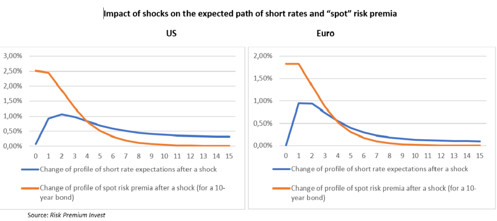
As expected, there is a fundamental difference between the dynamic of short rate and “spot” risk premia after a surprise in the market. The short rate is not expected to rise immediately as central banks adapt progressively their monetary policies to the novel situation. According to the model, the peak of short rates is expected in slightly less than two years in the US and in around 5 quarters in the eurozone. Moreover, long-term expectations seem less anchored in the US and the residual impact on the equilibrium short rate of a typical shock seems higher than in the eurozone. But despite these differences, the hunchbacked shape of expectations is broadly similar. There is no equivalence to this shape for the expected duration risk premium. Maximum impact is instantaneous: something happens which push investors to modify the “spot” risk premium required to bear the duration risk. There is a plateau: the new situation is likely to last for about one year, and after that the “spot” risk premium is supposed to go back progressively to an unchanged equilibrium level. Indeed, contrary to what is observed for short rates, especially in the US, the estimation refuses to show a long-term impact of a typical choc on risk premia. In some way, these estimate seem to confirm a point often made in this website: investors seem to have rather rigid views of the natural level of duration risk premia (see Has The Duration Risk Premia Turned Negative?). When the “spot” risk premia is at an “abnormal” level, investors tend to price the bonds of the various maturities under the assumption that it will come back in a few years to its “normal” level16.
This dynamic of the expected short rates and expected “spot” risk premia after a shock has some strong implications on how the shape of the yield curve usually changes day after day. According to our estimates, in normal times, half of the 10-year rates changes are explained by a revised path for short rate and the other half by markets pricing a new medium-term scenario for the “spot” duration risk premia. But the relative importance of the two short term sources of risk depends a lot on the bond’s duration.
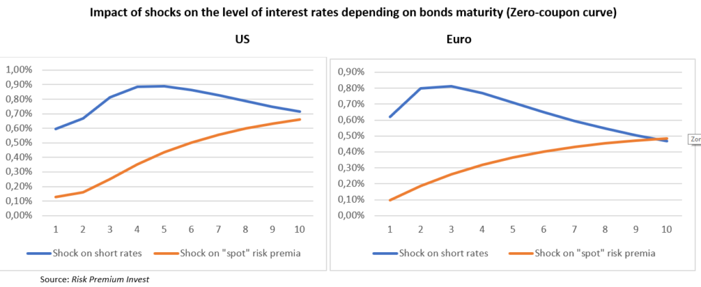
In the case of a shock on short rate expectations, the impacts on bonds are described again by a hunchbacked curb. Relatively short-term bonds are not very impacted since short term rates are not expected to rise immediately. At the other extreme of the yield curve, long-term rates take into account, especially in the Eurozone, the modest increase in the equilibrium short rate. Thus, the maximum impact on yields is felt by the medium-term bonds (three years in the Eurozone and four years in the US). The impact of a shock on “spot” risk premia is again rather different. There is no ambiguity and no bump: the impact on yield is systemically rising with the duration of bonds. The main reason is that risk premia are supposed to be proportional to bonds’ duration, thus long-term bonds are much more impacted than short-term bonds or even medium-term bonds. Yet, there is no explosion of the yield on very long-term bonds since their pricing benefit from the expected return in a few years of the “spot” duration risk premia to its “normal” level.
The significantly different impact of rising expected short rates and rising expected “spot” duration risk premia brings an important benefit: it becomes possible to “explain” the day-to-day movements of the yield curve. When the three years rate rise more than the 10 years rate, it is probably due to a shock centered on monetary policies and in the opposite situation, it is probably due to a change in risk premia. Moreover, when the yield curve moves in a strange way, i.e. when the shift on bonds of various durations cannot be described as a linear combination of the two types of shocks, this is the sign that something new is happening. For example, large (in our experience very rare) unexplained movements at the very long-term end of the yield curve probably indicate that investors start questioning their assumptions relative to the equilibrium duration risk premia.
This simplified model is used in our daily monitoring of markets (see here). The output of the model is in general very much coherent with the news flow arriving in the markets: when yield curves move without any significant macroeconomic news or comments from central bankers, the models always succeed in spotting movements purely related to risk premia. These models are also used to describe the risks faced by long-term investors to inform our asset allocations decisions.
As stressed at the beginning of this part, this simplified model of yield changes can be easily transformed analytically in a more traditional affine six-factor model (directly comparable to HT, KW and ACM). The main difficulty is to find a robust estimation technique in a context where six factors in level create a very large number of parameters to estimate. And where in our experience, the strong correlation between the instantaneous shocks (mainly two factors…) tends to create some numerical problems. We are very open to collaborations with academics on this topic.
From “explanatory” yield curve models to “explanatory” equity models?
To sum up again the situation, we have nice yield curve models who help to monitor the daily market movements and can be used to discuss the risks faced by long term investors in the government bond market. We don’t have yet the automatic one-click instrument which extracts the level of the “embedded” risk premia on bonds of various horizons and the accompanying expected short term rates over the medium and long term. But it is not that concerning since we can use surveys on expectations to manually extract these risk premia.
It seems interesting to transpose this discussion to the equity market. There, unlike in the bond market, there is no reliable survey allowing investors to extract what others think about long term profits and as a result the level of “embedded” risk premia. The consensus of financial analyst is rather short term and generally focused on the current quarter and the forthcoming year. Moreover, it is well-known that analysts tend to be over-optimistic on corporate profits at the one-year horizon.
This situation makes it very difficult to “explain” the observed valuations in equity markets. Thus, even more than in the bond market, it would make sense to build “explanatory” models using all the prices available to extract the “embedded” risk premia. And in some ways, the equity market has some characteristics that make it a very attractive candidate for this type of work.
In the government bond market, there is some limitation on data available. A yield curve is made of one rate by duration. In the equity market, there are thousands of equities that are priced and years of historical information on corporate profits. The intuition is that the identification problems that beset yield curve models (too many economic factors to estimate without enough data) would be much less of a problem in the equity market. Yet we don’t know of any academic paper trying to do with equities what has been done for a while with bonds (but we’ll happy to learn from readers some references we have missed!).
It is difficult to know why. One obvious factor is that the analytical modelling is much more difficult for equities. It is relatively easy to write a no-arbitrage affine model of zero-coupon government bonds, but much more difficult to do the same for dividends paying equities impacted by many different sources of risk (macroeconomic, sectoral, specific to the companies…). It was natural to start with the conceptually simpler problem raised by bonds. And indeed, an “explanatory” equity model cannot be built without an underlying robust yield curve model since interest rates are with profits expectations and risk premia one of the key drivers of stocks’ prices.
Thanks to the expertise gained in our yield curve modelling, we have tried to make some preliminary works on the equity side, and we find useful to share some thoughts.
The fact that our yield curve model allows to identify in the yield curve movements the part related to changes in monetary policy expectations is very important. Using a basic discounted cash flow model, it allows us to identify in changing equity prices what is explained by interest rates. This is done in our daily market monitoring. Now the question is: how can we finish the job and separate the respective roles of profits and risk premia?
We tried to follow several different approaches, but one of the most promising is the following.
The years 2010-2012 in the immediate aftermath of the financial crisis were years of economic recovery, but also of high volatility in financial markets. We were at the heart of the “risk-on/risk-off” process, with a high degree of correlation between various assets. All assets deemed risky tended to rise and fall together. And safe government bonds were moving predictably in the other direction. There was a very high and unusual correlation between risk premia changes over various assets classes. Thus, our explanatory yield curve model was providing information not only on the specific changes in the duration risk premia, but also on the risk premia on all other asset classes. When long-term rates fell due to lower duration risk premia according to our model, it was a strong indication that risky assets were suffering from the symmetric movement, i.e. a rise in risk premia (rather than a fall in expected profits).
Thus, as we got during this period a good proxy of the daily changes in the equity risk premia, it was possible to get an estimate of how the different sectors were reacting to these changes. Without surprises, there was some very large differences: some sectors were reacting much more strongly to changes in risk premia than sectors considered as defensive (the key defensive sectors in the US are the utilities and the consumer staples sector). As a result, the relative performances of various sectors may give information on whether the market movement is related to overall profits or changes in risk premia.
We have built a model based on this idea, and the elasticities revealed in 2010-2012, and it is actively used in our daily monitoring process. What is true for bonds (there is information in how two-year bonds move relative the 10-year bonds), is also true for equities (there is information in how consumer staples stocks move relative to financials). Yet, the explanatory efficiency of this explanatory tool is much worse than that of the yield curve model! The latter almost always provide an explanation of market movements which is in full accordance to the news flow we observe. This is not the case for the equity model and we must correct almost every day the estimated changes in equity risk premia: the sign of the change is generally right (risk-on versus risk-off), not the precise order of magnitude. There are many reasons for these disappointing results and the last one is probably the most interesting:
- The relative sensitivity of some sectors to changes in risk premia may have changed since the year 2010-2012 used to calibrate the model. In particular, this may be the case of financials.
- There are often some specific shocks on some sectors (interest rates for utilities, oil for energy) which introduce some noise in the process of “explanation”. Some work is ongoing to take into account the various sources of sectoral noise.
- Yet there is a more general question mark about the efficiency of equity markets and the right conceptual framework to be used. These sorts of “explanatory” models are based on the view that markets price risks on a rational manner and that relative prices can send information about the market “price of risk”. If, there are some recurrent risk mispricing, there is no more one unique “price of risk” and models will find very difficult to “explain” how prices change.
So, what have we learnt about this question of market efficiency along this (unfinished) journey in the land of “explanatory” models?
In the government bond market, there are both strong elements of market efficiency and market inefficiency. In the US and the Eurozone, the pricing of safe bonds of various maturities seem very coherent. An arbitrage based model seems able to explain all yields with a reasonable common path far in the future for short rates and “spot” risk premia17. In other ways, bonds prices of different maturities seem to price the same scenario. There is no obvious discrepancy that can be arbitraged away without taking risk. This is not surprising considering the large numbers of market participants looking for easy profits and all the models that have been developed. Yet, the issue of efficiency does not stop at this “technical” level of coherent pricing inside the asset class. The more important question is whether the scenario which is priced into the market is the most likely scenario. Is the market doing a good job in forming expectations on the future course of monetary policy and the future likely path for the “spot” duration risk premia? As far as the first aspect is concerned, there are many bright economists working on the question and central banks are currently doing their best to inform market participants (and more importantly to focus their research department on useful works needed to understand the future!). The question is much more open, as stressed all over this website, as far as risk pricing is concerned. Markets often seem to have a naïve and too rigid view about the equilibrium duration “spot” risk premia. This creates some “conundrum” and some instability (as sometimes fundamentalists are forced to capitulate). But there is nothing in this sort of inefficiency that can be arbitraged away rapidly with no risk!
There is no reason to expect the equity market to be much more efficient than the bond market in terms of average pricing. The equilibrium “spot” market risk premium may move over time and it is not sure that market participants are better equipped than in the bond market to integrate this instability into their process. On top of that, there are many signs that we don’t find in the equity market the same sort of “technical” intra market efficiency that we saluted in the bond market. And this may well explain the difficulty to build “explanatory” models. The work of investors in the equity market is made much more difficult by the very large number of economic and financial factors that drive returns. This is reflected in a simple exercise of Principal Component Analysis. When almost all the variability of the yield curve may be explained by three statistical (but not economic…) factors, the three first factors, quite hard to interpret economically, explain less than 50% of the variability of stocks.
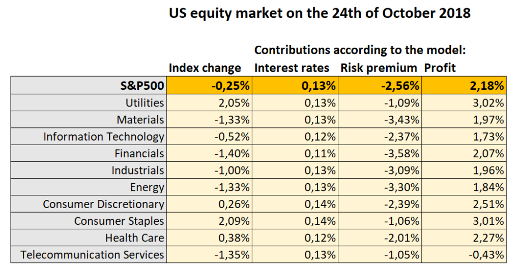
Let’s take an example of the sort of recurrent “technical” inefficiencies that we have spotted thanks to our daily monitoring of market. On the 24th October 2018, in a period of market instability, the S&P500 index lost 0,25% 18. The 10-year US treasury lost 2bp and our yield curve model told us that most of that small fall was due to the expectations of a slightly less hawkish Fed in a context of market turmoil. Everything else unchanged, this decline of rate would have justified a small rise of stock prices. Thus, there is a fall of 0,38% to be explained by new profits expectations or/and risk premia.
As illustrated in the following table, the striking aspect of this particular day was that there was a sharp divergence between the safe haven sectors (utilities and consumer staples which rose each by more than 2%) and the falling other sectors. This divergence shows for sure that the fall was triggered by a higher market risk premium. And indeed, this is how our model interpreted the day. Yet, there is an enigma: how can any sector rises when the market risk premium is moving higher? It is natural that some defensive sectors may be less negatively impacted than other, but how can they rise? In any model of arbitrage, investors who are looking to reduce their risks would more likely buy safe government bonds than push sharply higher the price of defensive stocks which are not free of market risk. Indeed, our “explanatory” model did not understand that day and concluded that to justify such a rise in the context of higher risk premium, there was probably some very good news on the profit side. Thus, it concluded that the risk premium was responsible for a decline of 2,56% of the S&P500 while a better outlook for profits boosted the index by 2,18% (see the table below). Obviously, this explanation does not make sense taking into account the news flow of the day and we cut both contributions in our daily monitoring PDF (see here).
To summarize, there are probably some fundamental inefficiencies in the equity market with many risk premia not fully consistent with the actual relative risks of a long-term investment in various stocks. Sometimes defensive stocks are too expansive: some investors seem to forget that they may also invest in bonds to protect their portfolio…. Sometimes, the same stocks are probably too cheap with investors hoping to surf a bubble in growth stocks… Market inefficiencies may explain why there are so many proprietary models that are not of the “explanatory” variety, but rather the trading tools we mentioned at the very beginning of this paper. With a bit of patience, there is some easy money to be made! This also explains the actual popularity of “smart beta” strategies pretending to beat the average market on a risk-adjusted basis (but beware if the inefficiencies are finally arbitraged away….).
The characteristics of the equity market make rather difficult to build efficient “explanatory” models, but at the same time makes even more interesting to work on them!
Version of November 7, 2018
- Even with the knowledge of all past tightening of monetary policy in the US, which helps establish some form of empirical relationship between the rates expected at different horizons. There is probably too much variability in the specific profiles of past tightening cycles to deduct precisely the full path of expectations with only a snapshot of three specific horizons.
- Adrian, T, R Crump and E Moench (2013): “Pricing the term structure with linear regressions”, Journal of Financial Economics, vol 110, no 1, pp 110–38.
- Kim, D and A Orphanides (2012); “Term structure estimation with survey data on interest rate forecasts”, Journal of Financial and Quantitative Analysis, vol 47, pp 241–72.
- Cohen, B., P. Hördahl and D. Xia “Term premia: models and some stylised facts”, BIS Quarterly Review, September 2018.
- Hördahl, P, O Tristani and D Vestin (2006): “A joint econometric model of macroeconomic and term structure dynamics”, Journal of Econometrics, vol 131, no 1/2, pp 405–44.
- In the post on Have The Duration Risk Premia Turned Negative?, this is the source we have chosen to show the history of “embedded” risk premia
- Indeed, in the HT specific model, there are only four factors driving the yield curve. Moreover, there is no factor specifically devoted to the description of risk premia. Risk premia, just like short rates, are supposed to be 100% driven by changes in the macroeconomic environment (output gap and inflation). We don’t think that It is a correct characterization of how markets are working.
- Kim, D and J Wright (2005): “An arbitrage-free three-factor term structure model and the recent behavior of long-term yields and distant-horizon forward rates”, Finance and Economics Discussion Series, Board of Governors of the Federal Reserve System, no 2005-33, August.
- But we should add that in the version of the HT model which appears in this graph, the same information from SPF was also introduced on top of their macro model. Thus, it is not surprising that there is some similarity.
- One may argue that with a six factors model, there is no way to challenge the path described by the surveys. This path will fix the three factors needed to describe the short rate expectations, while the “level”, “slope” and “convexity” of the yield curve will finish the job and fix the expected profile of the “spot” duration risk premium. This is not entirely true for two reasons. First, the model can find that the shape of the short rate expectations is abnormal and correct at the margin the profile. Secondly, there may be some information outside the yield curve: for example, if in the recent past, the excess return on bonds has been rather positive, most models would take that into account as a sign pleading for positive risk premia.
- Duffie, D and R Kan (1996): “A yield-factor model of interest rates”, Mathematical Finance, vol 6, pp 379–406, and Duffee, Gregory (2002), “Term Premia and Interest Rate Forecasts in Affine Models,” Journal of Finance, 57, pp.405-443.
- Monfort, A, F Pegoraro, J-P Renne and G Roussellet (2017): ”Staying at zero with affine processes: An application to term structure modelling”, Journal of Econometrics, vol 201, no 2, pp 348–66.
- This assumption does not contradict by itself the no-arbitrage assumption generally at the heart of affine models à la Duffie-Kahn. This is because one of the factors (linked to changes in the equilibrium short rate) has an impact on various bonds exactly proportional to their duration. Thus, to get the result we want, we have only to assume that only the price of risk on this specific factor moves over time.
- In order to facilitate the extraction of zero-coupon curves and forwards, we use in this estimation the dollar and euro swap rates.
- We don’t enter in this non-technical paper on the specific method used for this mapping.
- We should note that in order to estimate these models we have excluded in both zones the periods where short term rates were at the zero bound. It is very clear that with rates at the zero bound the expected path for short rates after a shock is constrained and that it would have biased the “normal time’” estimates. Yet, we insist in Has The Duration Risk Premium Turned Negative? on the role QEs played during that period to force fundamentalist investors to acknowledge the structural change in the equilibrium duration risk premia. This period of fundamental capitulation, probably exceptional by the bond market’s standard, is not taken into account in this estimation.
- More precisely, for the time being our model shows a large degree of coherence for yield changes. The coherence for the yield level is still an open question.
- Our monitoring of markets is done at the European Markets close. All these figures are taken at 5:30 PM (CET).